As a Linux user for the past three years (soon to be four), one of my absolute favorite aspects of using the OS is how much I can “rice” my system. I can tweak and customize everything to my liking down to shades and colors of applications. I can make my computing experience feel fresh and exciting whenever the urge strikes.
Meanwhile, Windows and macOS users only have a few options such as accent colors and the choice between dark or light mode. When you use Linux, just about anything can be fine-tuned or changed.
For me, it has also led to a meticulous tendency to have everything matching on my system. Every now and again, I’ll change and tweak my setup to go from one color scheme to another in an attempt to have everything nice and uniform. The effect makes daily tasks on my computer feel that much fresher and more appealing.
That’s why I decided to write about my top 3 favorite color schemes that I use on Linux.
Honorable Mentions
I like to make everything match as much as possible, so that means I ended up leaving out a few color schemes that are actually quite nice.
Solarized

We’re already starting with what is likely the most polarizing terminal color scheme I can possibly think of. When people think of Solarized, people typically either adore or despise it.
As much as I like Ethan Schoonover’s Solarized color scheme, I ultimately didn’t include it on this list because I failed to find a very good GTK theme that gels with it uniformly compared to the other ones on the list. I mean, I did find one that was updated, but it didn’t look quite right due to the contrast being a little off.
For me, everything has to match, and while many apps and terminals do support a very nice Solarized setup, I found that a GTK theme was that one missing, critical piece for me. It’s a shame because I really do like this theme and think that the Schoonover put an admirable amount of time and effort into making this theme as perfect as possible according to countless variables.
Arc-Theme

Another quick shout out to Arc-Theme, although I can’t help but wonder if this even counts as a color scheme, as I haven’t seen a dedicated set of color swatches for it. This entry is more for the look rather than the set of colors. I still remember that awesome feeling I had back in circa 2016 when I discovered an Arc-Dark theme patcher for Windows 10 and used it for a good while. While I’m not normally a fan of flat themes, Arc-Theme was a stark exception for me. I loved it from first install all the way until Windows updates broke it a couple of months later.
Additionally, as far as I’ve been able to tell, it doesn’t have a go-to terminal color scheme, and just like I said with Solarized, I like everything to match. However, if somebody really wanted to have a more consistent Arc-Theme with a matching terminal scheme, a few terminal themes from Kitty’s built-in selection or this Github page would probably be close enough.

Ayu-Mirage
My last honorable mention is Ayu-Theme, the theme that got me to take a break from my top theme for a good while. I recalled seeing it when exploring terminal themes within Kitty’s built-in theme selector.

The reason this is only an honorable mention deals with the fact that there is no go-to GTK theme to make it a full set. The closest I can find is the Juno Mirage theme from the Juno set of themes. It’s not a 1-to-1 match, but the yellow accents almost match Ayu’s overall aesthetic. Plus, there’s an Ayu theme built into Obsidian’s Minimal Theme selection, which also lets you come close to matching everything.
Still, unlike my top selections or even the likes of Solarized, I can’t really pinpoint any go-to wallpapers or backgrounds that best compliment Ayu as a whole. However, the biggest advantage Ayu has over even my top themes is how its palette of colors is rather diverse, allowing for a bit more fine-tuning with colors instead of feeling a bit limited by only a handful of hues and shades.
Now with that out of the way, let’s take a look at the top 3 color schemes.
Dracula

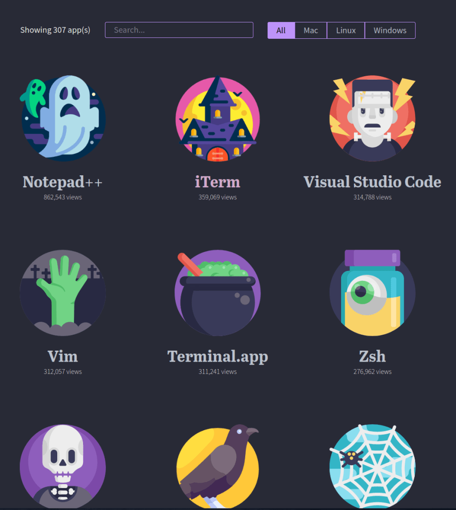
I’m going to start with a color scheme that can be used just about anywhere (and if it’s not, it will be sooner or later). Created by Zeno Rocha, the Dracula Theme is a slick color scheme of bluish-black backgrounds accented with saturated shades of purple and magenta.

I tend to use Dracula close to Halloween and had even riced my whole system with it a few months ago. With the color scheme available for over 300 apps across every major operating system (and always growing!), it’s hard to beat Dracula in terms of overall availability.
Zeno Rocha did such an excellent job that, at some point in 2021, I actually paid for Dracula PRO. He really makes the purchase worth your while with all sorts of resources, including a slightly tweaked color scheme (it’s very slight, but it’s there), downloads of wallpaper variants (even some in vertical aspect ratios for your phone), several fonts, an ebook for programmers and devs, and even access to a Discord server.
Granted, I didn’t use everything in the package, and I’m far from a developer (I’m barely even a sysadmin), but I was impressed with how Rocha really wanted to make a whole package you could feel great getting.
On a Linux system, I’ll typically set up Dracula with:
- Manual tweaks to my WM theme (I use the color swatches and this takes the most time, but it’s worth it)
- The GTK theme
- Papirus Folders (set to magenta)
- Selecting the Dracula theme in Kitty’s built-in themes.
- The Alacritty theme
- Rofi theme by adi1090x (there’s an option for Dracula)
- I use the powermenu and launcher with Dracula
- Minimal Theme through Obsidian (in settings, select Dracula)
- Spotify TUI
- SpaceVim (set
colorschemeto Dracula ininit.toml) - Wallpaper of choice
Dracula may not be my favorite color scheme, but it is one I do like quite a bit. I typically find myself switching over to it from time to time whenever the urge comes. The only meaningful drawback I can think of for Dracula (if you can even consider it one) is how there is no light theme variant right now. For years, the Dracula site did state that there would never be an official light theme, as “Dracula can’t stand the light.” I typically use dark themes 95% of the time and I do understand that light themes are generally unpopular compared to their dark counterparts, but sometimes I do want something different.
However, after years of maintaining this stance, Rocha has reneged on this stance and sent an email on March 7th this year regarding “Alucard,” an experimental light theme variant of Dracula. Derived from the name “Dracula” spelled backwards, the light theme is currently going through testing and is yet to be officially released in an official capacity by the site.
Gruvbox

I’m more than willing to admit that Gruvbox was a theme I originally didn’t see the appeal of when I first learned of it.
However, it was years later that someone pointed out how warm and welcoming the colors are, how lacking in blues they are (compared to many popular color schemes that almost always incorporate blue shades or hues somewhere). I saw the appeal when I looked at the theme this way, especially when the season was autumn and it seemed more fitting.

I know the theme started off as merely a terminal color scheme, but Gruvbox has grown quite a cult following. Despite lacking an official website, finding Gruvbox-inspired tweaks, wallpapers, and much more is easier now than ever. There even exists a Gruvbox Factory script that converts existing wallpapers through a Gruvbox-color filter.
I understand not seeing much appeal in it the first time around, but when you do see it, it’s easy to get swept up in making everything match the style. Once it “clicked” with me, I needed to have everything match.
On a Linux system, I get a Gruvbox theme set up with:
- Manual tweaks to my WM theme (using color swatches from the Github page)
- The GTK Theme
- Papirus Folders (set to darkcyan)
- Selecting the Gruvbox Dark theme in Kitty’s built-in themes.
- The Alacritty Theme (select the
gruvbox_dark.yamlin the themes directory) - Rofi theme by adi1090x (this time with the theme set to Gruvbox)
- I use the powermenu and launcher
- Minimal Theme through Obsidian (set to Gruvbox; this Obsidian theme is gorgeous)
- SpaceVim (default theme for SpaceVim is Gruvbox; nothing to change)
- Wallpaper of choice (or throw something into Gruvbox Factory)
Gruvbox is an excellent choice and comes in both a dark and light variant. The light variant is also merciful to the eyes with its cream-colored background reminiscent of paper, which puts it a tremendous step up over many other light variants of color schemes.
While my Arch desktop may be decked out in a different color scheme (more on that in a bit), my current openSUSE Tumbleweed workstation is sporting Gruvbox everything from the Waybar theme, wallpapers, and terminal setup.
Nord

Yeah, this one was obvious for me. Nord is my all-time favorite color scheme when I first discovered it, and it still remains my number one choice.

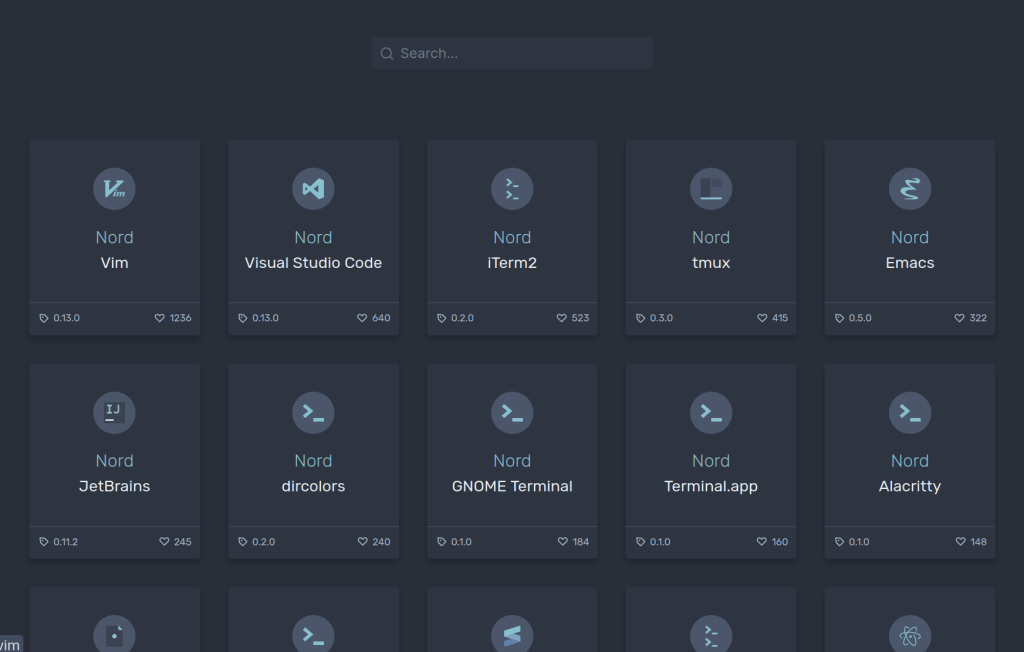
Just like Dracula (and unlike Gruvbox), Nord has its own website to find ports of the color scheme for various apps. Unfortunately, it does fall drastically short compared to Dracula in terms of how many apps are supported. In fact, some of the links in that screenshot above are dead ends that give you a “Coming Soon” sort of message.
Despite that, Nord more than makes up for that in terms of looks. Just like Gruvbox, there is a dedicated community out there helping to theme applications and wallpapers in Nord. This cool, chilly color scheme was my go-to when winter rolled in, and I’m still using it now.
This theme is the one I’ve stuck around with the longest since I decided to rice my whole system with it. I can’t get enough of it. I mean, at the time I write this, my site is themed in these colors. I love this smooth, bluish palette and I especially like how well the colors were chosen to handle contrast.
On a Linux system, I run Nord with:
- Manual tweaks to my WM (using color swatches on Nord Theme website)
- The GTK Theme
- Or alternatively (and far better), Adapta-Nord
- Papirus Folders (set to nordic)
- Or alternatively, Nordzy-Icon Pack
- UPDATE: Papirus-Nord to get more Nord colors
- The Alacritty Theme
- UPDATE: After switching to Kitty, I can just run
kitty +kitten themesand select the Nord theme
- UPDATE: After switching to Kitty, I can just run
- Rofi theme by adi1090x (set color scheme to nord)
- Again, I use launcher and powermenu
- Minimal Theme through Obsidian (set to Nord)
- SpaceVim (set
colorschemeto nord)- UPDATE: I have switched to the Neovim-based LunarVim, so I now install this theme from shaunsingh to theme Nvim and lualine.
- Wallpaper of choice (small collection available here or use ImageGoNord to convert something)
- Convert any lower-res wallpapers with Upscayl
- Nordzy-cursors
Just like Gruvbox, Nord also comes in both a light and dark variety, but unlike many other color schemes out there, Nord Polar (the official name of the light variant) is something I would actually consider using for more than a couple of days. The white backgrounds have a slight tinge of bluish grey that still makes it easy to look at compared to the competition.
Nord is still my favorite despite me having taken a break from it in favor of my Ayu-Mirage honorable mention. When I had that urge to use Nord again, I went all-in on it once more as if I never left. It is hands-down my top theme.
Conclusion
These are the three color schemes I normally gravitate towards on Linux. While I adore Nord, I will sometimes crave a little change and cycle toward Gruvbox or Dracula before winding right back up on Nord.
Do you have any favorite color schemes or themes that you like to use? Or do you simply prefer having a light or dark toggle? Are there any other complete color schemes I should consider taking a look at?
Further Reading
My Top 3 Tiling Window Managers
5 Fantastic Lightweight Distros to Run on Old Hardware
Turning GNOME Into a Tiling Window Manager
Last updated April 19, 2024.


One response to “My Top 3 Linux Color Schemes”
[…] style and feel of the site to change drastically. I’ll be welcoming the changes by changing the Nord color scheme of the entire site to look more like Solarized Light. That’s when you’re going to know that the changes […]
LikeLike